Tuesday, May 10, 2011

American Home, Indian Heart


This is my final 2pg spread for Visual Journalism. I was assigned Anuradha Rana for this culturally focused project. After interviewing her about her life in India, and her job as a filmmaker in Chicago, I decided to format my story into a Q&A because it's one of my favorite styles as a story. The layout, "American Home, Indian Heart," was supposed to show Rana in her culture as well highlighting her work.
The main photo is of Rana on a camel safari, and it was the most intriguing photo that she gave me because it is a representation of her in her culture. The other photo I choose to include is of her working. The map was made in InDesign and it just shows where she grew up and went to school. As for the sidebar, I made a film strip and included her body of work, and information about the film. The colors I used for the whole project was trying to match the colors of her culture, which is oranges, pinks, browns, and yellows. Overall I think it turned out pretty well.

Tuesday, April 5, 2011

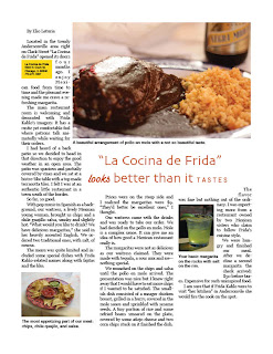
For this assignment we were given a story and template and we had to create a layout for it. I wanted to keep it really simple. The main picture I used was a main dish at the restaurant. The other two pictures were other things the writer wrote about. I decided not to change the title, I felt it suited it well, and I wanted to use a lighter orange red for the headline to make it pop, but not pop too much. 

Tuesday, March 15, 2011

Website-Molly's Cupcakes

For our mid-term, I designed a web-page for delicious cupcake shop, Molly's Cupcakes. I wanted it to be really fun and playful.I took pictures at the shop, along with pictures of my friend. I had the idea of her tip-toeing her way through a field of cup-cakes, and because cupcakes are bright and colorful, I made her put on colorful socks. I also took pictures of her holding the cupcake and eating them. For the colors of the website, I choose to use pastel colors for the overall image to match the sweetness feeling. On the sides of the website, I made a mini border of, suppose to be, Polaroid pictures of my friend with the cupcakes. I felt like it needed something to make it more fun, and what's more fun then Polaroid pictures. I also choose to draw little bumble bees flying around the website because bumble bees remind me of spring, which brings a lot of colors to my mind. As for the captions, I have one main caption giving an explanation of the shop, and the other two are playful captions to get people to buy their cupcakes.
Hope this makes you want to go eat a cupcake at Molly's...they are so yummy! :) 

Photo Restore

This is the original picture that we had to restore.


What I did to restore this image is I took out all the holes by "stamping" colors around the holes on top of the holes so it blends in. I also put some white under the eyebrow to make her look more alive. I added very lightly cheekbones, but nothing major. I also adjusted the magenta, to make it a little more pink. 

Wednesday, March 2, 2011

Infographic

I don't like how this turned out at all, but this is all I could do with the time given. There was just too much information that had to be included, and it wasn't really anything interesting. I'm still getting used to InDesign and for the things I wanted to do, I just didn't know how. I didn't want to do just a table or anything either, so yeah this is it.

Tuesday, February 22, 2011

An Exact Replica

For this assignment we had to replicate a magazine page exactly how it was shown. I found this assignment easy, it was just a lot of work. I started off doing the title then working my way from left to write.

Monday, February 14, 2011

Show me some CoLoR!

Our next assignment was to replicate our first image, but add some color. We were told to do warm colors, and then I choose to do the other with pastel colors. When I was doing the warm image, I had a fiesta in the back of my mind. I wanted it to be fun and playful. As for the other image, I had vintage in the back of the mind.